Elegant, exquisite fruit tree woods create a calm contrast to oak, ash and the like. The striped all-over pattern Toulouse Cherry – developed exclusively for Pfleiderer – was launched in 2021 in a classic darker shade of cherry; it is now joined by a lighter version with an understated interplay of colours and a silky-looking surface finish. It goes perfectly with dark taupe shades such as “Fjord” or “Labrador”, and upgrades mother-of-pearl decors.
Extremely versatile crown cut planked birch
Light woods are making a comeback, as they add an uncomplicated and casual touch to interiors. However, they should not be too plain; Oulanka Birch is therefore an extremely versatile crown cut planked birch decor that impresses with dark crotch figures, sections with curly figures and an interplay of colours that range from grey to brandy. Oulanka Birch creates a warm, cosy background for cheerful, daring combinations with large-scale graphic decors, textiles or metals.
Artisan Oak Anthracite
Artisan Oak Anthracite is the fourth colour in the Pfleiderer Artisan range. Crown cut, planked, lively, yet nevertheless well-balanced. The typical, distinctive blackened knots are absorbed by the dark anthracite shade, which makes the decor considerably lower in contrasts than the versions in natural and grey. It therefore looks very homogeneous and understated, and can be used not only for furniture fronts but also for furniture carcasses and interiors.
Caletta
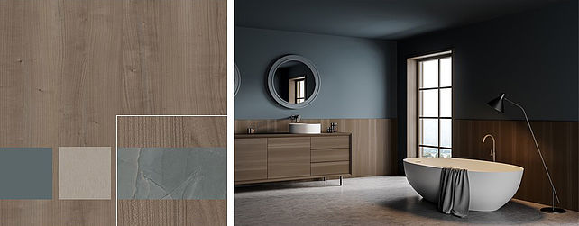
A light, friendly oak decor that looks particularly natural due to its lively grain and subtly nuanced shades between a reddish brown and grey. Fine details such as contrasting knots and splits develop their full impact particularly well on fronts and horizontal areas in kitchens and bathrooms. Warm shades of beige, brown and greige as well as pastel shades of blue work very well with this light oak and create an overall well-balanced look. Striking, dark steel decors or understated textile decors are other suitable combination partners.
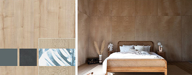
Connery natural
The Connery range is brought to life by its straight lined, Nordic look that suggests a hand-crafted character and three-dimensionality. The direction and pattern of the grain on each stripe differ from the next, some are fine and some are curly; the long edges look rounded. The grooves are embodied by dark pilaster strips. Connery Natural is a light, friendly shade of ash that is subtly contrasted by natural-colours as well as grey pores.
Connery Horizon
The Connery range is brought to life by its straight lined, Nordic look that suggests a hand-crafted character and three-dimensionality. The grain of the stripes varies, and is emphasised by dark pilaster strips. Connery Horizon is dyed in the colour shade U18029, which is subtly contrasted by light pores. It goes particularly well with cool shades of blue and metal decors, as well as, of course, the matching plain decor. Large vertical areas are perfect for this range.
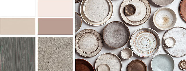
Trend colour - Powder
The colour “Powder” has been an up-and-coming trend for years. The rose shades of the past years have increasingly become earthier, along the same lines as pastels becoming taupe. Terracotta and “Powder” are back! Soft, natural and material shades are quiet, feminine companions for many woods and materials. They soften dark and ground light woods, whilst introducing colour in an unobtrusive way. Powder shades unite colours taken from nature and create a well-balanced overall look.
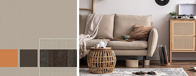
Classic linen decor - Costa beige
Wood and textile decor combinations are a particularly common and popular choice for living room furniture. They add a casual touch to fronts, define the style and pull together the upholstered furniture and the furnishing fabrics. The classic linen decor Costa Beige perfectly meets this requirement, especially in combination with dark woods. The irregular texture of the weave with an interplay of colours that range from grey to shades of sand adds a casual, relaxed touch. A second version is F76169 Costa Anthracite.
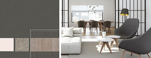
Costa anthracite
Wood and textile decor combinations are a particularly common and popular choice for living room furniture. They add a casual touch to fronts, define the style and pull together the upholstered furniture and the furnishing fabrics. The classic linen decor Costa Anthracite perfectly meets this requirement, especially in combination with light-colours or black woods. The irregular, monochrome texture of the weave looks calm and expansive and perfect in combination with warm shades of white and taupe. A second version is F76170 Costa Beige.
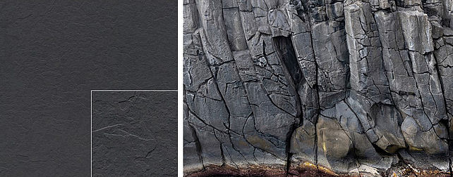
New HPL Texture PT Porto
The deep slate texture Porto has a smooth surface that is enlivened by some more and some less polygonal matt areas. The depth of the texture can be felt by the cutting edges of the various levels that are typical for slate. In the right light, the sharp cutting edges show reflections, and shadows on the opposite side, which emphasises the three-dimensionality also in a visual way. Porto looks particularly natural on slate decors, but just as interesting on ceramic or concrete, as well as dark plain decors. Porto is available as HPL texture and suitable for horizontal as well as vertical use. It is non-directional.
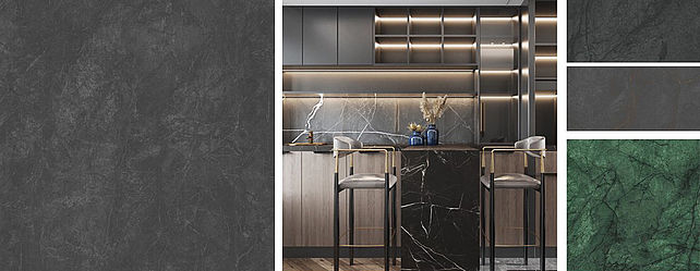
A spectrum of black stones - Range Caviar
In the past few years, marble has become one of the preferred stones in interior design. Used generously, its sophisticated look upgrades furniture and rooms. Stones were used for the first time on vertical areas of furniture. After busy multicoloured decors rich in contrasts, things are now calming down. Expansive, rather monochrome, with single veins only running through it here and there. The Caviar range offers a spectrum of black stones, in part with unusual metallic veins running through it.
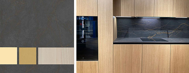
Caviar Gold
Caviar Gold is one of the four marble decors in the Caviar range. Expansive and monochrome, these decors offer many different furniture and interior design combination options. The sharply outlined veins are open and carefully distributed across a surface with minimal cloudy contrasts. Particularly unusual is the gold tone of the veins, which has a mother-of-pearl radiance that goes perfectly with respectively matching metal decors. Even with overlay, the metallic shine can still be experienced.
Cracked Marble Plaster
The particularly matt, polished looking surface, the generously-sized pattern with sharply contrasting splits and also the well-balanced soft contrasts provided by the expansive sections make the range of Cracked Marble decors so successful. S63058 Grey Blue Cracked Marble and S63056 Greige Cracked Marble are now joined by the monochrome and therefore even more versatile version Plaster. This stone goes particularly well with dark woods and warm metal shades.
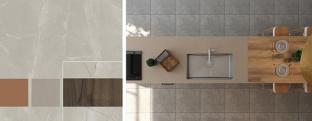
Tosca
Expansive light stones are a friendly, warm alternative to the many grey and/or dark materials. Tosca is one of the new travertine decors that impresses even without the often dominant holes. Instead, the vertically-oriented stone decor features a rather grainy looking surface and sand-like colour gradients with a wide spectrum, from blue to powder, sand and greige shades. Almost all plain colours therefore go well with this; light woods are a fresh combination.